Curated blog with news, events, listings, jobs and exciting stories about web design & web development.

Butter Announces New Session Layout
Chris from Butter has just announced a new session layout for its video conferencing platform for interactive online workshops, training, and meetings.
New Session Layout
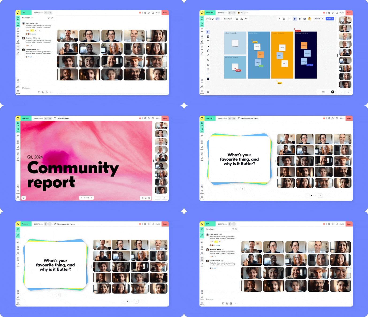
On Monday 22 January, the Butter team will introduce a new session layout designed to maximize space for online team collaboration. With 15% more space to get creative, you can now enjoy tools like Miro, Mural, screen sharing and more in an edge-to-edge format, giving your attendees a truly immersive experience.
The updated layout brings a fully featured sidebar and a beautiful new top bar with everything you need. Your toolbox and templates are no longer floating around on their own, but have joined the company on the left. This gives you more space and makes it much easier to find exactly what you need.
What’s Next?
Next, Butter will release new grid views that allow you to place video tiles above or below the main content being shared. There will also be a massive update to the polls. Stay tuned!
Biff Codes - The Job Board for WordPress Devs
Biff.codes is on a mission to revolutionize job boards. Post and find WordPress developer jobs for free.
FTC Disclosure: We may receive a payment in connection with purchases of products or services featured in this post.




Add your first comment to this post