Curated blog with news, events, listings, jobs and exciting stories about web design & web development.
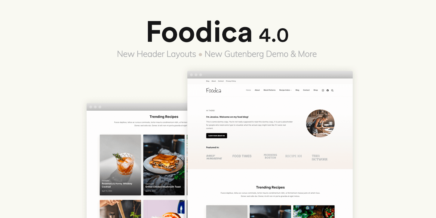
Foodica 4.0: New Header Layouts & Gutenberg Starter Site
The folks at WPZOOM have just released Foodica 4.0, introducing new header layouts, a new sidebar panel and a new Gutenberg-powered starter site for their popular food blog theme for WordPress.
New Header Layouts
An error occurredWith the three new header layouts, Foodica 4.0 now lets you choose a more compact header layout. Since this saves space, your visitors will see more valuable content aka delicious recipes above the fold. This should also have a positive effect on the bounce rate.
Improved Tablet & Mobile Navigation
An error occurredTo give your readers an app-like experience on tablets and mobile devices, WPZOOM has added a sidebar panel that can be toggled via the hamburger icon. You can fully customize the sidebar panel by adding blocks and widgets.
New Starter Site
An error occurredWith the new Foodica starter site, you can now create your food blog using only the WordPress editor.
Simply use the beautiful pre-made layouts created with Gutenberg blocks for your front page, info and contact pages.
All sections are also available as free block patterns for food bloggers, e.g. a recipe index, a search bar and latest posts.
Image Size Control
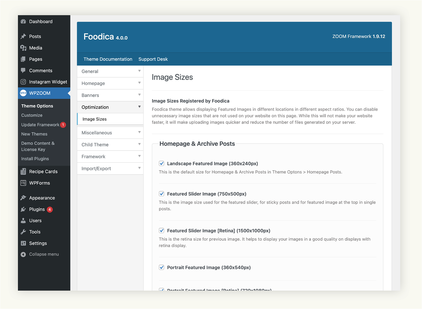
Many features of the Foodica theme require images to be displayed in different sizes and aspect ratios. With the new “Optimization” section, you can define in the “Theme Options” which sizes the theme should generate and which not.
This is useful if you want to reduce the number of files created on your server.
Biff Codes - The Job Board for WordPress Devs
Biff.codes is on a mission to revolutionize job boards. Post and find WordPress developer jobs for free.
FTC Disclosure: We may receive a payment in connection with purchases of products or services featured in this post.


Add your first comment to this post