Curated blog with news, events, listings, jobs and exciting stories about web design & web development.
LearnDash Introduces New Modern, User-Friendly Registration Page
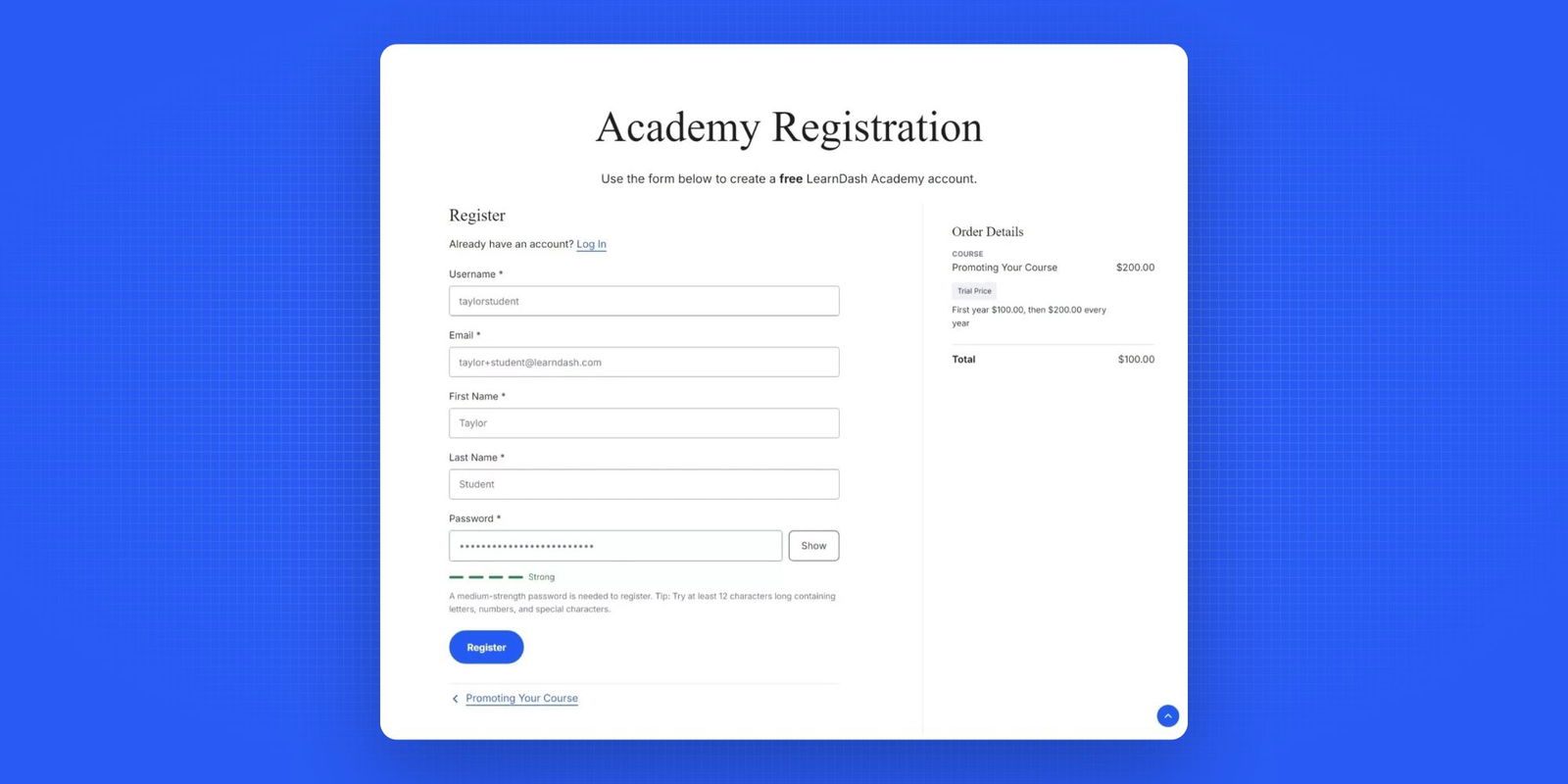
Taylor from LearnDash has just announced the release of a new sleek, modern and user-friendly registration page for the WordPress LMS plugin.
New Registration Page
The new LearnDash registration page offers a streamlined and user-friendly experience, with improved usability and clear payment options. It introduces a modern two-column layout, standardized headers and updated form widths for a clean, polished look.
Check out the benefits:
- Improved User Experience:
- Real-time form validation and a hide/show password feature increase security and convenience.
- The mobile layout is optimized to reduce abandonment and increase conversions.
- Higher Conversion Rates:
- The update not only modernizes the look and feel, but also significantly improves the user experience, resulting in higher conversion rates aka course registrations.
- A smooth, intuitive registration process keeps users engaged and reduces abandonment.
The refresh currently only applies to LearnDash registration, checkout and login. Further improvements to the LearnDash frontend are coming soon. Stay tuned!
Biff Codes - The Job Board for WordPress Devs
Biff.codes is on a mission to revolutionize job boards. Post and find WordPress developer jobs for free.
FTC Disclosure: We may receive a payment in connection with purchases of products or services featured in this post.






Add your first comment to this post