Curated blog with news, events, listings, jobs and exciting stories about web design & web development.
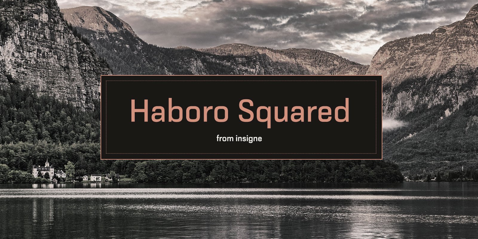
Haboro Squared Font Evokes The 1950s & 1960s
Jeremy from insigne just released his latest font family called Haboro Squared. With its clean and consistent strokes, it evokes the good old 1950s and 1960s.
Haboro Squared Font
An error occurredHaboro Squared is an impressive typeface that conveys accuracy and utility with its clean, consistent strokes. After the war years during WWII, people began to feel optimistic about the future again in the 1950s and 1960s. This era is reflected in the gently rounded letters, playful alternates, and versatile use of the Haboro Squared font. It is ideal for a logo, packaging design, and as a headline for a website or magazine article. Haboro Squared manages the balancing act between modernity and nostalgia perfectly.
The family consists of eight weight, ranging from Thin to Black, each with a corresponding italic.
Also, take at the entire Haboro Hyperfamily which includes Haboro Sans, Haboro Serif, Haboro Soft, Haboro Didone, and many more.

Biff Codes - The Job Board for WordPress Devs
Biff.codes is on a mission to revolutionize job boards. Post and find WordPress developer jobs for free.
FTC Disclosure: We may receive a payment in connection with purchases of products or services featured in this post.


Add your first comment to this post