Curated blog with news, events, listings, jobs and exciting stories about web design & web development.
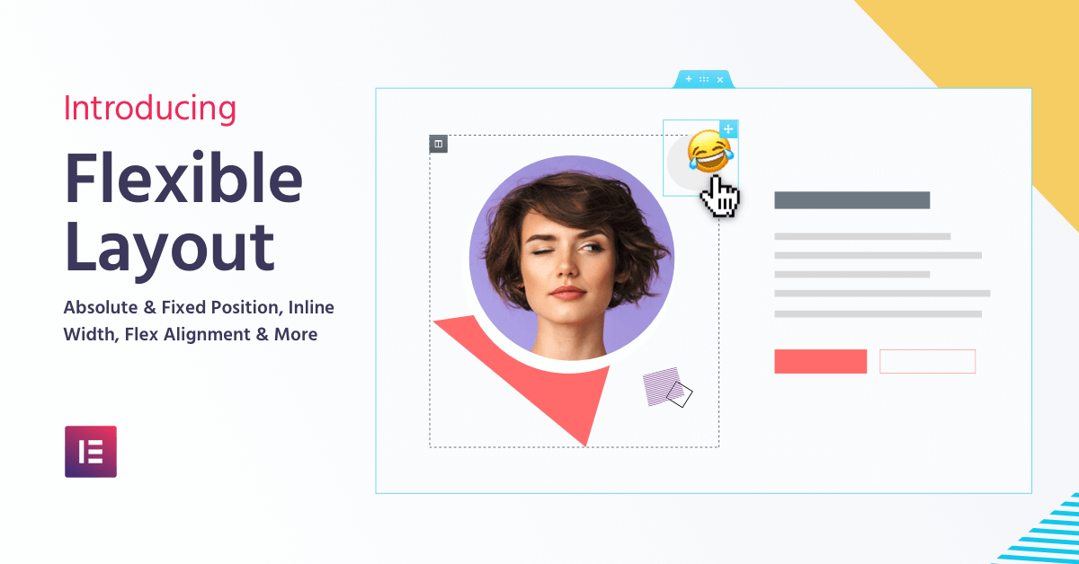
Elementor: New Flexible Layout For A Top-Notch Design Experience
The Elementor team did it again, one great new feature follows the next. Just think of the amazing design-oriented Popup Builder! With Elementor 2.5 they just announced a flexible layout for their WordPress page builder plugin.
Flexible Layout
Elementor now comes with a set of web design controls including Position Absolute, Position Fixed, Inline Elements, Vertical & Horizontal Flex Alignment, and more.
Inline Elements
Set Side-By-Side Widgets Easily: You can now set widgets to be inline, meaning each widget will take up the minimum width it holds. Use inline width to place two buttons side-by-side inside the same column.
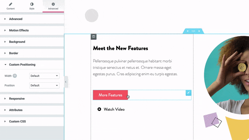
Absolute & Fixed Position
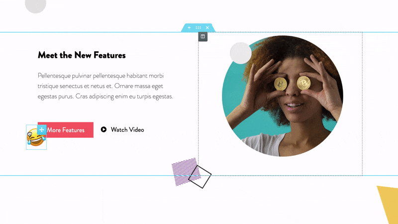
Move Widgets Around Freely: Use Position Absolute to freely drag widgets anywhere on the page, or choose Fixed Position to have it follow as the visitor scrolls through the page.
Vertical & Horizontal Alignment
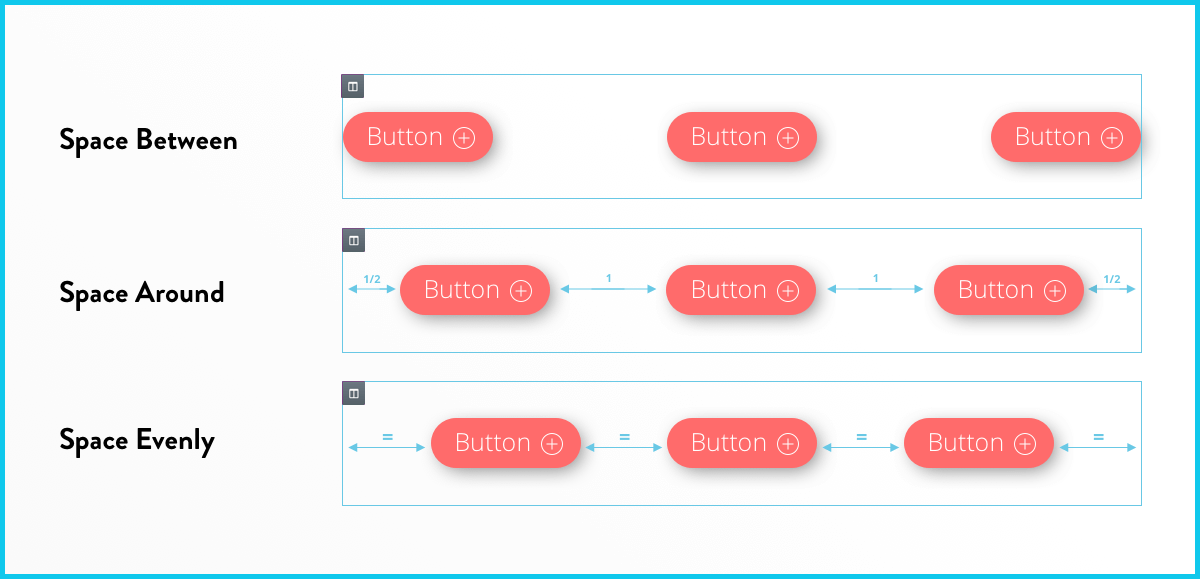
The Power of Flexbox: Easily spread widgets across and down the column using new flex options: space between, space around & space evenly.
In addition you are now able to show or hide columns per device. Also, you can divide your Text Editor widget into columns, specify columns per device and set the gap between the columns. In terms of performance, they reduced the editor loading time by more than 50%. What a fantastic and exciting update!

Biff Codes - The Job Board for WordPress Devs
Biff.codes is on a mission to revolutionize job boards. Post and find WordPress developer jobs for free.
FTC Disclosure: We may receive a payment in connection with purchases of products or services featured in this post.


Add your first comment to this post