Curated blog with news, events, listings, jobs and exciting stories about web design & web development.
How To Turn Gravity Forms Checkboxes & Radio Fields Into Buttons
When it comes to form plugins for WordPress, you are spoilt for choice. There are excellent plugins such as Ninja Forms, Fluent Forms and Gravity Forms. However, if you also want to create beautiful forms or forms that are almost unrecognisable as such, then the latter is for you. More precisely, Gravity Forms and the fantastic collection of JetSloth add-ons.
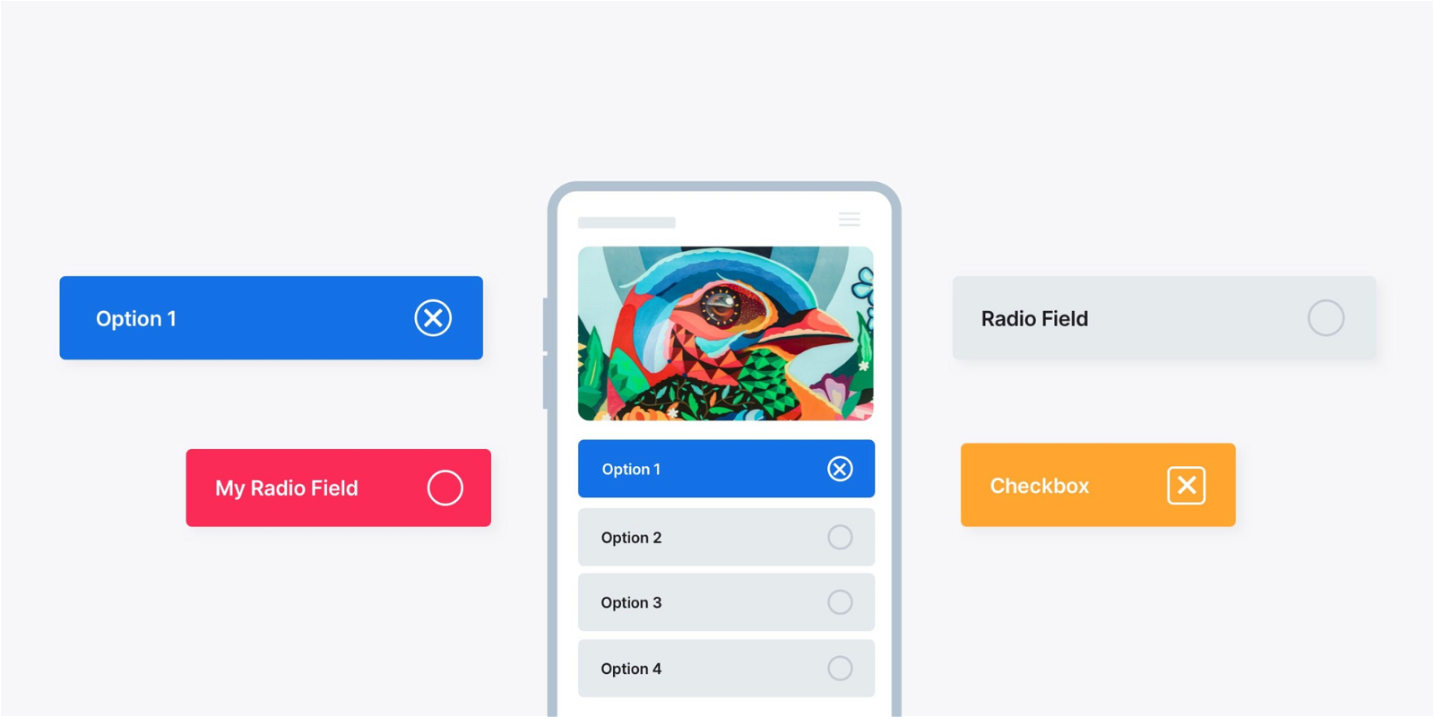
Styled Radio Fields & Checkboxes
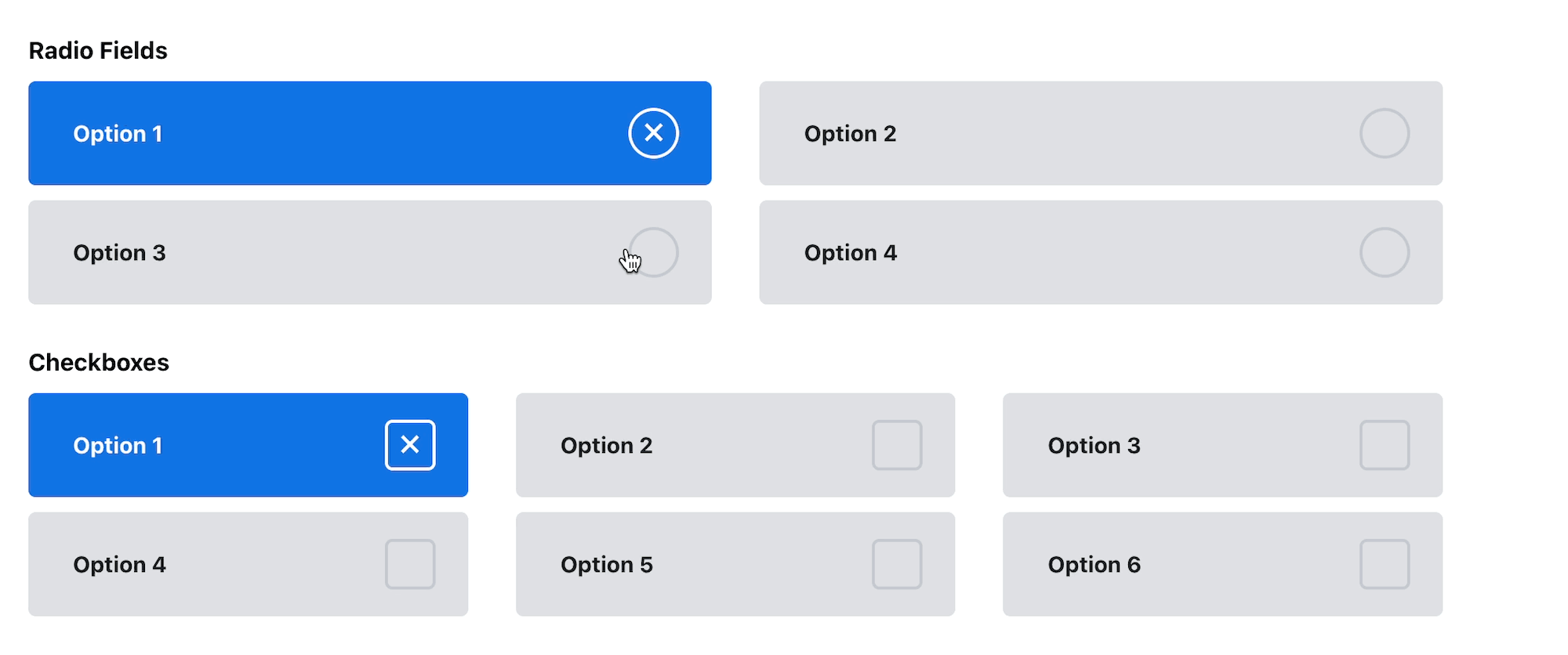
Simply use the following custom CSS provided by JetSloth to transform the rather ordinary radio fields and checkboxes into modern, engaging buttons. Note that you will get the best results with Gravity Forms 2.5+ and its new markup.
Gravity Forms 2.5+ CSS
/*Gravity Forms 2.5+ CSS Styled Radio & Checkbox fields*/
.gchoice {
    z-index:1;
    position:relative;
    margin:0 0 10px 0;
    padding:0;
    height:70px;
}
input.gfield-choice-input {
    z-index:2;
    appearance:none;
    margin:0;
    padding:0;
    width: 100%;
    border-radius: 5px;
    height:100%;
    background: white;
    transition: .3s all ease-in-out;
    position:absolute;
    background:#dfe1e5;
    position:absolute;
}
input.gfield-choice-input:hover,
.gchoice label:hover {
    cursor:pointer;
}
input.gfield-choice-input:checked {
    background:#1273e6;
}
input.gfield-choice-input:checked + label {
    color:white;
}
.gchoice label {
    z-index:3;
    font-weight:700;
    color:#141c25;
    display:block;
    position: absolute;
    padding: 0 0 0 30px;
    top: 50%;
    transform: translateY(-50%);
    width:100%;
    overflow:visible;
}
input.gfield-choice-input + label:after {
    content: "";
    position: absolute;
    right: -10px;
    transform: translateY(-50%);
    width: 30px;
    height: 30px;
    border: 2px solid #c5c9d2;
    z-index: 2;
    top: 50%;
    transition: .3s all ease-in-out;
    color: white;
    font-size: 25px;
    text-align: center;
    line-height: 25px;
    font-weight: 500;
}
input[type="checkbox"].gfield-choice-input + label:after {
    border-radius: 5px;
}
input[type="radio"].gfield-choice-input + label:after {
    border-radius:50px;
}
input.gfield-choice-input:checked + label:after {
    content: "\00D7";
    border: 2px solid white;
}
Gravity Forms Legacy Markup
/* ////////////  Legacy CSS version //////////// */
.gform_legacy_markup_wrapper.gform_wrapper li.gfield ul li.gchoice {
    z-index:1;
    position:relative;
    margin:0 0 10px 0;
    padding:0;
    height:70px;
}
.gform_legacy_markup_wrapper.gform_wrapper li.gfield ul li.gchoice input {
    z-index:2;
    appearance:none;
    margin:0;
    padding:0;
    width: calc(100% - 10px);
    border-radius: 5px;
    height:100%;
    background: white;
    transition: .3s all ease-in-out;
    position:absolute;
    background:#dfe1e5;
    position:absolute;
}
.gform_legacy_markup_wrapper.gform_wrapper li.gfield .gchoice input[type="radio"]:hover,
.gform_legacy_markup_wrapper.gform_wrapper li.gfield .gchoice label:hover {
    cursor:pointer;
}
.gform_legacy_markup_wrapper.gform_wrapper li.gfield .gchoice input:checked{
    background:#1273e6;
}
.gform_legacy_markup_wrapper.gform_wrapper li.gfield ul.gfield_radio li.gchoice label,
.gform_legacy_markup_wrapper.gform_wrapper li.gfield ul.gfield_checkbox li.gchoice label{
    z-index:3;
    font-weight:700;
    color:#141c25;
    display:block;
    position: absolute;
    padding: 0 0 0 30px;
    top: 50%;
    transform: translateY(-50%);
    width:100%;
    max-width: 100%;
    overflow:visible;
}
.gform_legacy_markup_wrapper.gform_wrapper li.gfield ul.gfield_radio li.gchoice input:checked + label,
.gform_legacy_markup_wrapper.gform_wrapper li.gfield ul.gfield_checkbox li.gchoice input:checked + label{
    color:white;
}
.gform_legacy_markup_wrapper.gform_wrapper li.gfield .gchoice input + label:after{
    content: "";
    position: absolute;
    right: 30px;
    transform: translateY(-50%);
    width: 30px;
    height: 30px;
    border: 2px solid #c5c9d2;
    z-index: 2;
    top: 50%;
    transition: .3s all ease-in-out;
    color: white;
    font-size: 25px;
    text-align: center;
    line-height: 25px;
    font-weight: 500;
}
.gform_legacy_markup_wrapper.gform_wrapper li.gfield ul.gfield_checkbox li.gchoice input[type="checkbox"] + label:after {
    border-radius: 5px;
}
.gform_legacy_markup_wrapper.gform_wrapper li.gfield ul.gfield_radio li.gchoice input[type="radio"] + label:after {
    border-radius:50px;
}
.gform_legacy_markup_wrapper.gform_wrapper li.gfield .gchoice input:checked + label:after {
    content: "\00D7";
    border: 2px solid white;
}
To get the 2 column and 3 column layout effect, simply add the Gravity Forms CSS column classes into the appearance tab of each field group.
Gravity Forms Sloth Bundle
Do you also want to spice up your WordPress forms? Get the Gravity Forms Sloth Bundle for just $129 which includes Collapsible Fields, Bulk Actions Pro, Color Picker, Tooltips, Bulk Add Fields, and Images Choices.
Speaking of, you can also create stunning forms with JetSloth‘s Image Choices and the Page Transitions add-on from Gravity Perks.

Biff Codes - The Job Board for WordPress Devs
Biff.codes is on a mission to revolutionize job boards. Post and find WordPress developer jobs for free.
FTC Disclosure: We may receive a payment in connection with purchases of products or services featured in this post.


Add your first comment to this post