Curated blog with news, events, listings, jobs and exciting stories about web design & web development.
How To Improve Posts Table Pro For Mobile Devices
Posts Table Pro is the WordPress table plugin for automatically listing posts, pages, custom post types, and more. Whilst it works correctly on all devices out of the box, there is a lot you can do to optimize your users’ experience on mobile. Let’s have a look at three easy ways to improve post tables on mobiles.
Create Dynamic WordPress Tables In No Time »
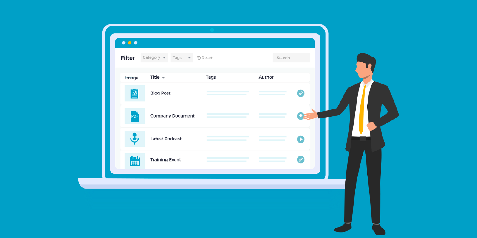
1. Set Column Priorities
Your tables automatically adapt to the respective screen size. For example, if you have too many columns in your table to fit on the screen, some columns disappear into a hidden child row. Users can then click on the green + symbol to display these hidden columns.
In fact, this is a great way to make tables work on small screens, especially when having a lot of columns. However, it is important to make sure that the right columns are hidden!
You can use the priorities option to control the order in which columns will be moved into the hidden child row. Simply set the highest priority for important columns to ensure that they are always visible.
2. Use Column Breakpoints For Fine-Grained Control
For more control over which columns to show on each type of device, you can use the column breakpoints option. For example, you can specify that certain columns are only visible on desktops, only on mobile devices, hidden on all devices and more.
3. Control Hidden Columns
Finally, in the Responsive Display option, you can choose what happens when someone clicks on the + symbol to display the hidden columns.
- Child Row – Hidden columns appear in a new row underneath
- Child Row Visible – Hidden columns are always visible in an extra row below so that users can see them without having to click on the icon
- Modal – Hidden columns appear in a lightbox or modal window
No matter which option you choose, you should test your tables on different screen sizes and experiment with these options.
Create Dynamic WordPress Tables In No Time »

Biff Codes - The Job Board for WordPress Devs
Biff.codes is on a mission to revolutionize job boards. Post and find WordPress developer jobs for free.
FTC Disclosure: We may receive a payment in connection with purchases of products or services featured in this post.


Add your first comment to this post